Using Histograms to Determine Manufacturability
IS YOUR PRODUCT DESIGNED FOR MANUFACTURABILITY?
As highlighted in the earlier blog post (Smart Prototyping: Turning Your Idea into a Real Product (Part 1)) the middle phase of the product development cycle is where we cross the chasm between prototype and production.
You think you’ve got a real slick product that many folks will want to buy.
The prototypes came together without too many glitches.
The functionality is there.
Great.
But, can this product be manufactured in volume? How can we figure this out quickly? There are some great ways to visualize data to get a quick reading on product manufacturability.
Before discussing the specific measurements to take with your product, let’s start with some fundamental concepts of engineering manufacturability and design.
GRAPHING YOUR DATA: HISTOGRAMS
Whenever I take any measured data, the first thing I do is generate a plot of how frequently data values fall within ranges, or “bins”, to get a sense of how much variation there is in the process. A column chart that shows the frequency that values fall within various bins is called a Histogram.
If you have a statistics software package, then using histograms for production readiness assessments is easy. Just enter the measured data for your parameters in a single column with one measurement per row, and tell the program you want to generate a histogram with this data. Out pops the graph. Most statistics programs will automatically determine how many bins to sort the data into and provide you with a graph that is easy to interpret.
If you don’t have an advanced statistics application like MiniTab, you can still generate histograms very easily with MS Excel or GoogleDocs Spreadsheets
GET A VISUAL
Now that you have histograms of your data, it’s easy to get a good visual indication of product manufacturability. Before we consider the specification limits of a parameter, it is best to look at the histogram to characterize the process. Some questions to ask yourself:
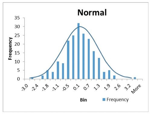
1) We’ve discussed Gaussian distribution in a previous blog post. Well here is your chance to apply that concept to your data. Is the data clustered around a well defined central mean, and does the population of each bin get smaller as you look in either direction from that central mean? If so, you likely have a “normal” distribution, which is an indication of a process that is in control. Normally distributed data looks like a symmetric peak as shown in Figure 1.

Figure 1. Normal Distributed Data
2) Do you see a clearly defined peak, but one or several pieces of data that are in bins seemingly off on their own? In this case, you likely have a process that for the most part is in control, but every once in a while produces an “outlier” where the process breaks down. These outliers can then be analyzed for root cause and corrective action. Which data do you think are outliers in the plot in Figure 2? There are statistical tools we will introduce later that quantify outliers, for now anything greater than 2.0 and less than -2.1 should probably be investigated.
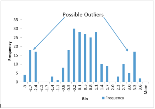
Figure 2. Normal Data With Outliers
3) Do you see more than one peak? This is called a “bimodal” distribution and can be an indicator of a process shift, which may warrant further investigation to find the cause and mitigate. Can you identify the two distributions in Figure 3? The primary appears centered at about 0.3, and the secondary at about 2.1.
CONSIDER SPECIFICATION LIMITS
Now that you have characterized your processes to get an initial reading whether they are in control or not, it is time to take spec limits into consideration. Specification limits should be determined by the range of values, or tolerance range, that the measured parameter can fall within and still have the part, or next level assembly, function as desired.

Figure 3. Bimodal Data
Take your histogram and write your upper and lower specification limits on the X-axis. How do they compare to the distribution of your data? Are all measured points within your limits? How much margin do you have?
How you react to out of specification parts depends on whether the process is in control or not (“gaussian, gaussian, gaussian” again). If the process appears in control, then perhaps your specifications are too tight for the process to meet higher yields. In this case loosening the requirements or finding a new process should be considered. If the process is not in control, then process improvements need to be implemented before performance against requirements can be determined.
HISTOGRAMS INDICATE MANUFACTURABILITY
In a nutshell, using histograms can provide a great visual description of your data and allow quick indications of product manufacturability. There are many statistics that can be used to further enhance your understanding…we’ll get into those in later posts. In the meantime, have you plotted histograms on some of your data? What did you learn? Care to share?
Mike Pelstring is an engineering, operations, and quality assurance leader with success in precision electromechanical components, wireless networks, lighting controls, hardware, software, firmware, computer storage and defense electronics industries.
Along with directing operations and hardware teams, Mike has taught senior and grad level semester courses in Design for Manufacturing in the Mechanical and Aerospace Engineering department at San Jose State University
His specialties include expertise in the application of statistics to manufacturing and product design. Six Sigma Master Black Belt, Design for Six Sigma